React Widget 구현하기.
2023. 4. 8. 18:27
728x90
반응형
살다보면 스티커 메모처럼 위젯을 구현하고 싶을때가 온다.. 나만그럴수도있고
그럼 이 위젯을 어떻게 만들어야할까?
우선 GridLayout에서 만들것이므로
NewGrid.js
import React, { useState } from "react";
import ResizableWidget from "./ResizableWidget";
import "./NewGrid.css";

const Grid = () => {
  const [widgets, setWidgets] = useState([
    { id: "1", text: "Widget 1" },
    { id: "2", text: "Widget 2" },
    { id: "3", text: "Widget 3" },
  ]);

  const handleRemoveWidget = (widgetId) => {
    setWidgets((prevWidgets) =>
      prevWidgets.filter((widget) => widget.id !== widgetId)
    );
  };

  const handleAddWidget = () => {
    const newWidget = {
      id: `${widgets.length + 1}`,
      text: `Widget ${widgets.length + 1}`,
    };
    setWidgets((prevWidgets) => [...prevWidgets, newWidget]);
  };

  return (
    <div className="grid-container">
      <button className="add-button" onClick={handleAddWidget}>
        +
      </button>
      {widgets.map((widget) => (
        <ResizableWidget
          key={widget.id}
          id={widget.id}
          text={widget.text}
          onRemove={() => handleRemoveWidget(widget.id)}
        />
      ))}
    </div>
  );
};

export default Grid;
NewGrid.css
.resizable-widget {
    border: 1px solid #ccc;
    border-radius: 6px;
  }

  .widget-header {
    background-color: #ccc;
    border-top-left-radius: 5px;
    border-top-right-radius: 5px;
    padding: 0.5rem;
  }

  .widget-content {
    padding: 0.5rem;
  }

  .widget-footer {
    display: flex;
    justify-content: flex-end;
    padding: 0.5rem;
    position: absolute;
    bottom: 0;
    left: 0;
    right: 0;
    background-color: rgba(255, 255, 255, 0.7);
  }

  .remove-button {
    background-color: transparent;
    border: none;
    cursor: pointer;
    font-size: 1rem;
    margin-left: 0.5rem;
  }

  .add-button {
    position: absolute;
    top: 0;
    right: 0;
    font-size: 1rem;
    position: absolute;
    z-index: 10;
    padding: 0.5rem;
    border: none;
    border-top-right-radius: 5px;
    background-color: #ccc;
    cursor: pointer;
    font-size: 1.5rem;
    line-height: 1;
    transition: transform 0.2s ease-in-out;
  }

  .add-button:hover {
    transform: scale(1.1);
  }

  .grid-container {
    position: relative;
  }

  .layout {
    position: relative;
    height: 100%;
  }

  @media (max-width: 768px) {
    .layout {
      margin-left: -10px;
    }
  }

  @media (max-width: 576px) {
    .layout {
      margin-left: -8px;
    }
  }

  .rounded-widget {
    border-radius: 10px;
    overflow: hidden;
  }

  .resizable-widget textarea {
    width: 100%;
    height: 100%;
    resize: none;
    border: none;
  }
ResizableWidget.js
import React, { useState, useRef } from "react";
import { ResizableBox } from "react-resizable";
import Draggable from "react-draggable";
import "./ResizableWidget.css";

const ResizableWidget = ({ id, text, onRemove }) => {
  const [widgetText, setWidgetText] = useState(text);
  const textareaRef = useRef(null);

  const handleTextChange = (event) => {
    setWidgetText(event.target.value);
  };

  return (
    <Draggable handle=".widget-header">
      <ResizableBox
        className="resizable-widget"
        width={200}
        height={200}
        minConstraints={[100, 100]}
        handle={
          <div className="resize-handle">
            <span className="icon"></span>
          </div>
        }
        onResize={(event, { size }) => {
          if (textareaRef.current) {
            textareaRef.current.style.width = `${size.width}px`;
            textareaRef.current.style.height = `${size.height - 60}px`;
          }
        }}
      >
        <div>
          <div className="widget-header">
            Widget {id}
            <button className="remove-button" onClick={onRemove}>
              삭제
            </button>
          </div>
          <div className="widget-content">
            <textarea
              ref={textareaRef}
              style={{ width: "100%", height: "calc(100% - 60px)" }}
              value={widgetText}
              onChange={handleTextChange}
            />
          </div>
        </div>
      </ResizableBox>
    </Draggable>
  );
};

export default ResizableWidget;
ResizableWidget.css
.resizable-widget {
    position: relative;
    background-color: #fff;
    border-radius: 10px;
    box-shadow: 0 2px 4px rgba(0, 0, 0, 0.2);
    overflow: hidden;
    margin: 10px;
  }

  .widget-header {
    display: flex;
    justify-content: space-between;
    align-items: center;
    padding: 0.5rem;
    font-weight: bold;
    background-color: #2196f3;
    color: #fff;
  }

  .remove-button {
    background-color: transparent;
    border: none;
    cursor: pointer;
    font-size: 1rem;
    margin-left: 0.5rem;
  }

  .widget-content {
    padding: 0.5rem;
  }

  .resize-handle {
    position: absolute;
    bottom: 0;
    right: 0;
    width: 24px;
    height: 24px;
    border-top: 4px solid rgba(0, 0, 0, 0.1);
    border-right: 4px solid rgba(0, 0, 0, 0.1);
    background-color: #f1f1f1;
    cursor: nwse-resize;
  }

  .resize-handle .icon {
    position: absolute;
    top: 50%;
    left: 50%;
    transform: translate(-50%, -50%);
    width: 8px;
    height: 8px;
    border-left: 2px solid #333;
    border-bottom: 2px solid #333;
  }

  .widget-footer {
    display: flex;
    justify-content: flex-end;
    padding: 0.5rem;
    position: absolute;
    bottom: 0;
    left: 0;
    right: 0;
    background-color: rgba(255, 255, 255, 0.7);
  }

  .widget-footer button {
    background-color: transparent;
    border: none;
    cursor: pointer;
    font-size: 1rem;
    margin-left: 0.5rem;
    margin-right: 0.5rem;
    transition: transform 0.2s ease-in-out;
  }

  .widget-content {
    padding: 8px;
    background-color: #f0f0f0;
    border: 1px solid #ccc;
    overflow: auto;
  }


  .widget-footer button:hover {
    transform: scale(1.1);
  }

  .dummy-button {
    padding: 0.5rem 1rem;
    border-radius: 5px;
    border: none;
    background-color: #e0e0e0;
    color: #333;
    font-weight: bold;
    text-transform: uppercase;
    transition: background-color 0.2s ease-in-out;
  }

  .dummy-button:hover {
    background-color: #bdbdbd;
  }
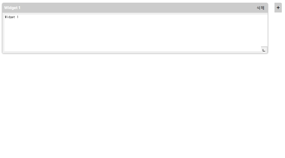
이렇게 구성해놓고 실행해보면 다음과 같이 나온다.

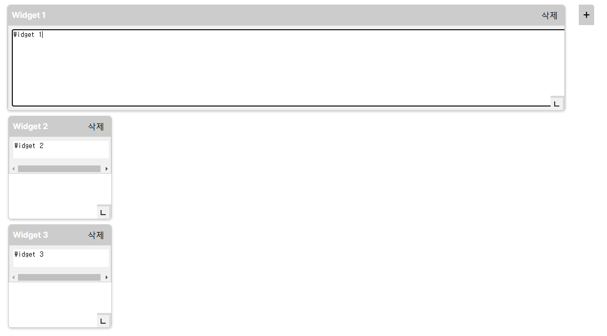
이런식으로 길게 늘려서 쓸수도있고,
삭제를 누르게 되면 삭제가 된다.
없애버린 위젯은 옆에 + 버튼을 누르면 생성이 되고, 안에 글자도 쓸 수 있다.
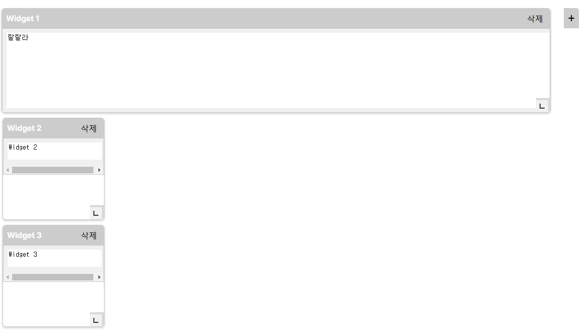
또한 위젯은 자유롭게 이동도 가능하다!

css더 수정하고 하면 좀 좋은 구도의 스티커 메모가 생길거같다.
728x90
반응형
'DEV > React' 카테고리의 다른 글
| ReactJS - 리로드 안될 때? (0) | 2023.07.30 |
|---|---|
| React 에러 - Starting the development server...Error: error:0308010C:digital envelope routines::unsupported 해결 (0) | 2023.07.29 |
| 최근 트렌드에 맞는 React 웹 디자인 UX/UI 구현하기 - 6편 (사용자 피드백 제공, 웹 접근성) (0) | 2023.04.07 |
| 최근 트렌드에 맞는 React 웹 디자인 UX/UI 구현하기 - 5편 (컴포넌트 라이브러리, 로딩 애니메이션) (0) | 2023.04.06 |
| 최근 트렌드에 맞는 React 웹 디자인 UX/UI 구현하기 - 4편 (색상 팔레트, 아이콘 라이브러리 사용) (0) | 2023.04.05 |
반응형
공유하기
'DEV/React' 의 관련글
-
ReactJS - 리로드 안될 때? 2023.07.30더보기
-
React 에러 - Starting the development server...Error: error:0308010C:digital envelope routines::unsupported 해결 2023.07.29더보기
-
최근 트렌드에 맞는 React 웹 디자인 UX/UI 구현하기 - 6편 (사용자 피드백 제공, 웹 접근성) 2023.04.07더보기
-
최근 트렌드에 맞는 React 웹 디자인 UX/UI 구현하기 - 5편 (컴포넌트 라이브러리, 로딩 애니메이션) 2023.04.06더보기
250x250